A library can say a lot about a city. It can be bold and modern, historic and rooted in classic architecture principles from the past – or even a combination of all these, reflecting both where a city came from and where it is going.
Case in point is the incredible main library of the San Francisco Public Library, located downtown in the Marshall Square Civic Centre. The building features elements of the past and the city’s famously progressive nature and spoiler alter – it’s a complete stunner.
Completed in 1996 after three years of construction, the main library is an impressive 375,000 square feet, twice the size of its predecessor. The construction ended up costing nearly $105 million, funded through a combination of bonds and private donations.
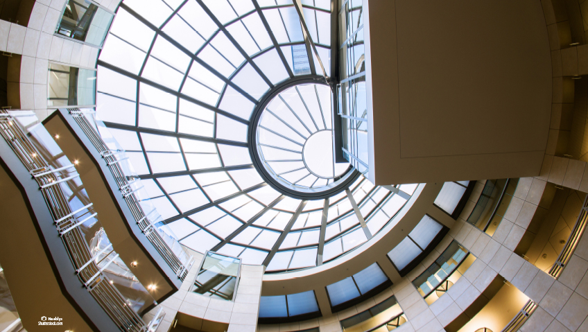
The most dramatic feature? A massive skylight at the centre that spirals upward, allowing the natural light to reach down through the five floors of the central atrium.
The building boasts meeting rooms that can accommodate 544 people and an auditorium with 235 seats. Overall, the main branch has the capacity to seat just over 2,000 people. It sees an average of 1.7 million a visitors a year.
The main branch opened at an interesting time. Back in 1996, the internet moved from a relatively new and limited resource for information into people’s homes through America Online (including the funny noises as the internet was piped through phone lines). From there, the internet advanced exponentially through broadband and then was taken everywhere through mobile devices.
All these advances had implications for all aspects of our lives, but directly impacted libraries. Before the internet was everywhere, it was libraries that were the place to go to for research, reading and getting questions answered. But, for many libraries in the age of the Web 2.0 and beyond, the question is, where do they fit in?
In a recent American Libraries Magazine article, Susan Nemitz, director of Santa Cruz Public Libraries in California, talks about the important bridge that libraries provide in their communities. “We find that more and more, our community is isolated. We’ve been moving from being a warehouse of books to being a social connector.”
This concept of being an integrator for a community has long been a part of the San Francisco Public Library philosophy. In 2009, the library became the first to bring in a full-time social worker, Leah Esguerra. In an interview with NPR, she talked about the unique situation of working in a library.
“There was no blueprint. The public library is not a traditional setting for a social worker,” says Esguerra. And coming out of the pandemic, challenges with mental health and homelessness in particular are becoming more prevalent.
“I walk around and try to talk to people who might be experiencing homelessness,” she says. “We never ask them directly, but I would just come up to them and say, ‘I don’t know if you’re aware but there are social services here.’”
When it comes to programming, the main library has a broad outreach, with workshops and readings in multiple languages, art exhibits, speaker series and a variety of accessibility resources.
Integrated, flexible spaces in the San Francisco main library are part of the building’s makeup and help facilitate these programs. The interior layout is centered on that impressive open staircase in the atrium that is 60 feet in diameter. As you climb up, you will see the glass-enclosed periodicals reading room.
Throughout this space, bridges link the different areas of the library, providing access to both online resources as well as the three million books that are available to check out. The interior design earned architect firm Pei Cobb Freed & Partners an Interiors Award when the main library opened in 1996.
On the outside, there are different faces to the library depending on which street you are walking on. The two symmetrical façades of the library facing the Civic Center feature a sierra white granite that is the same used for other civic buildings in the city set in the Beaux-Arts style. The other two façades that face the commercial district are more contemporary by contrast, reflecting the technology-driven enterprises in the heart of Silicon Valley. And being a significant building in California, the main library is also designed to withstand earthquakes.
It may sound like a lot to ask to be able to withstand one of nature’s most devastating events, but there are principles that go into resisting the effects of an earthquake. The first is building a foundation on top of pads that actually separate the building from the ground. Then you want to dampen the destructive seismic energy emitted by an earthquake. The engineering for this structural technique was developed by NASA to dampen the force of rockets launched into space. Fluid-based systems absorb some of the force to reduce the impact to the building.
Once steps are taken to reduce the impact of an earthquake, the building itself needs to be reinforced to help withstand a sudden impact. The design principles here are to place rigid joints in strategic spots while allowing other parts of the building to move. The ‘bend, don’t break’ principle is applied to choice of construction materials. In this case, structural steel has the strength to support buildings in normal times but also the flexibility to give but not snap when an earthquake strikes.
The main library building itself is set on 142 base isolators that are made with rubber layers between stainless steel ones that dampen the vibrations. In fact, the building is engineered to provide resistance to earthquakes up to an 8.3 magnitude, and in the event of a sudden shock, there is an 18-inch ring around the building that actually allows the library building to move independently from the ground.
And whether it is the protection the structure provides, or the architectural principles that are applied to the shape and the space of the building both within and without, the key is how all of these elements work together to create a great experience for visitors and patrons.
The library’s multipurpose teen space, called The Mix, is a nearly 5,000-square-foot section designed by youth in collaboration with an architect. It has a quiet space for chilling with laptops and books, a room for board games, a music studio where you can record on guitar and keyboard, a maker space, study nooks and video games on a massive projector. The whiteboard on the wall posts activities like a creative writing group and book club. Programs are all free and open to drop-ins.
In fact, the library earned the prestigious national Library of the Year Award in 2018 that recognizes innovation and service.
A library, after all, really is an oasis from the whirl of cities and a place that people go to feel safe and learn more. While the San Francisco main library may mean different things to different people, the design of the building makes it adaptable to accommodate the diverse community that it’s built to serve.

